

10 Fresh Accent Wall Color Ideas for a Stunning Home in 2026
An accent wall is more than just a splash of paint; it's a strategic design choice that can redefine a room's entire atmosphere. This single design element can establish a powerful focal point, introduce depth to a smaller space, or inject a bold dose of personality without the commitment of a full-room makeover. The right color anchors your furniture, highlights architectural features, and sets the emotional tone, transforming a plain room into a curated, intentional space.
However, the sheer volume of choices can be paralyzing. How do you select a shade that harmonizes with your existing decor while still making a statement? This is where a thoughtful collection of accent wall color ideas becomes an essential tool. Moving beyond generic advice, this guide provides ten curated color concepts designed to inspire and inform. We will explore specific shades, from the calming earthiness of warm terracotta to the sophisticated depth of charcoal gray, providing you with a complete roadmap for implementation.
For each color, we will detail:
- Complementary Palettes: Specific color combinations that ensure a cohesive look.
- Styling and Accessory Tips: Actionable advice on pairing sofas, art, and textiles.
- Lighting and Finish Notes: Practical guidance on how paint finishes and light sources affect the final color.
This comprehensive list is designed to eliminate guesswork. Whether you are revitalizing your living room, creating a serene bedroom retreat, or designing a nursery, you will find tangible inspiration and the practical details needed to turn a simple wall into your home's most compelling feature. Let's explore how to use color to create a space that truly reflects your personal style.
1. Sage Green
Sage green is a muted, earthy hue that infuses spaces with a sense of calm and quiet sophistication. This soft, grayish-green tone has become one of the most sought-after accent wall color ideas for its ability to create a restorative atmosphere. It strikes a perfect balance between nature-inspired warmth and contemporary elegance, making it a versatile choice for nearly any room in the house.
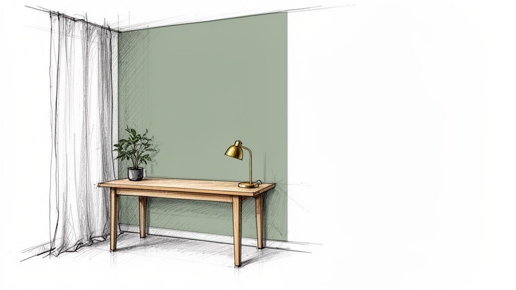
Unlike bolder greens, sage acts as a sophisticated neutral, providing a gentle pop of color without overwhelming the senses. This makes it an ideal backdrop for bedrooms, home offices, and living rooms where relaxation and focus are key. Its inherent connection to the natural world promotes a feeling of tranquility, aligning perfectly with wellness and minimalist design trends.
Implementation Guide
- Complementary Palette: Pair sage with creamy whites, soft beiges, and muted taupes for a serene look. For contrast, introduce accents of terracotta, dusty rose, or deep navy.
- Recommended Finishes: A matte or eggshell finish is ideal. These non-reflective surfaces enhance the color's soft, velvety quality and minimize imperfections, contributing to a more high-end appearance.
- Lighting Notes: Sage green truly shines in natural light. In rooms with less sunlight, use warm-toned lighting (around 2700K) to prevent the gray undertones from feeling too cool or stark.
Styling and Accessory Tips
To bring your sage green accent wall to life, incorporate natural textures and materials. Think light-toned wood furniture, woven jute or sisal rugs, and linen or cotton textiles. Brass or gold hardware and lighting fixtures add a touch of warmth and glamour that contrasts beautifully with the cool green.
Designer Insight: For a cohesive look, pull the sage color into the room through small decor items like throw pillows, ceramic vases, or art prints. This creates a layered, intentional design that feels professionally styled.
This color is particularly effective in designs that blend rustic and contemporary elements. For more inspiration on how to integrate this earthy tone, explore these modern farmhouse decorating ideas to see how natural colors can elevate your space.
2. Warm Terracotta
Warm terracotta is an earthy, rust-inspired tone that evokes Mediterranean charm and bohemian elegance. This rich, sun-baked hue brings incredible warmth and depth to a room, creating an atmosphere that is both inviting and energetic. As one of the most distinctive accent wall color ideas, terracotta makes a bold statement while remaining grounded in natural, organic appeal.
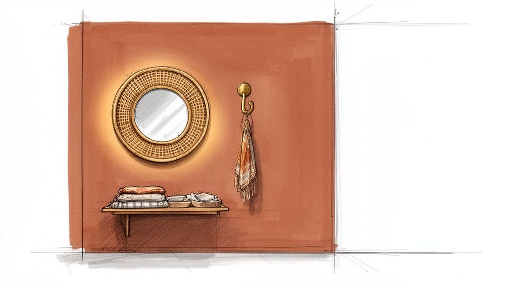
Unlike conventional neutrals, warm terracotta introduces a dynamic yet comforting energy. It is an excellent choice for social spaces like living rooms and dining areas, where its welcoming vibe encourages conversation and connection. The color’s inherent connection to clay and earth makes it a cornerstone of boho and eclectic design styles, providing a stunning backdrop for unique art and decor.
Implementation Guide
- Complementary Palette: Pair terracotta with creamy ivories, sandy beiges, and soft grays to let its warmth take center stage. For a more dramatic and worldly look, introduce accents of deep teal, olive green, or mustard yellow.
- Recommended Finishes: A matte or flat finish is highly recommended. These finishes absorb light, enhancing the color's rich, earthy texture and giving it a sophisticated, velvety appearance that minimizes wall imperfections.
- Lighting Notes: Terracotta thrives in abundant natural light, which brings out its golden and red undertones. In darker spaces, use warm-toned light bulbs (2700K-3000K) to ensure the color feels cozy and inviting rather than dull or brown.
Styling and Accessory Tips
To complement a warm terracotta accent wall, lean into natural materials and handcrafted textures. Rattan or cane furniture, macramé wall hangings, and jute rugs enhance its bohemian spirit. Metallic accents in brass, copper, or matte black provide a modern contrast that elevates the entire look.
Designer Insight: Use the terracotta wall as a gallery space. Its rich color makes a fantastic background for artwork with neutral mats, antique mirrors, or floating wooden shelves displaying ceramic or stone objects.
This color is a perfect foundation for creating an eclectic, free-spirited interior. To fully embrace this aesthetic, find more inspiration with these bohemian home decor ideas and discover how to layer textures and patterns effectively.
3. Deep Navy Blue
Deep navy blue is a sophisticated, timeless hue that brings an undeniable sense of elegance and luxury to any interior. This classic tone is one of the most powerful accent wall color ideas for creating a space that feels both grounded and opulent. It works beautifully in traditional and modern settings, offering a dramatic backdrop that feels curated and high-end.
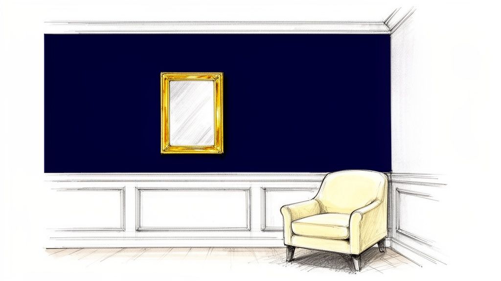
Unlike black, navy blue provides depth and moodiness without absorbing all the light, making it a more approachable choice for creating a cozy, enveloping atmosphere. It's particularly effective in master bedrooms, home offices, and formal living rooms where you want to establish a sense of distinguished style and intimacy. Its rich, saturated quality makes it an excellent canvas for showcasing art and metallic decor.
Implementation Guide
- Complementary Palette: Pair deep navy with crisp white or soft cream trim for a sharp, classic contrast. For a warmer, more contemporary feel, introduce accents of mustard yellow, burnt orange, or rich caramel leather.
- Recommended Finishes: An eggshell or satin finish offers a subtle sheen that reflects a small amount of light, preventing the dark color from feeling flat. This finish is also more durable and easier to clean than matte.
- Lighting Notes: Ample lighting is key. In rooms with abundant natural light, navy feels bold and confident. In darker spaces, use layered warm lighting, including sconces and table lamps, to create pools of light that enhance the color's sophisticated depth.
Styling and Accessory Tips
To elevate a deep navy accent wall, integrate metallic accessories. Brass, gold, or silver hardware, mirror frames, and light fixtures will pop against the dark background, adding a touch of glamour. Balance the color's weight with light-colored furniture, such as a beige sofa or white console table, to maintain visual harmony.
Designer Insight: Use navy blue to create a focal point behind a key piece of furniture, like a headboard in a bedroom or a credenza in a dining room. This technique anchors the room and adds architectural interest without overwhelming the space.
This color is surprisingly effective in smaller rooms, creating a jewel-box effect that feels intentionally cozy. To master using bold colors in compact areas, explore these small living room decorating ideas for inspiration.
4. Blush Pink
Blush pink is a soft, muted tone that has moved beyond its traditional associations to become a symbol of modern elegance and warmth. This sophisticated, dusty shade of pink offers a subtle yet impactful option for accent wall color ideas, creating an inviting and nurturing atmosphere without feeling overly sweet. It provides a chic, gentle warmth that feels both contemporary and comforting, making it a favorite for personal sanctuaries like bedrooms and living spaces.
Unlike its brighter counterparts, blush pink acts as a "new neutral." It carries a delicate hint of color that adds personality and light to a room while remaining incredibly versatile. Its understated femininity makes it a sophisticated choice for spaces designed to feel calming and chic, from a home office to a primary bedroom, embodying a modern, grown-up aesthetic.
Implementation Guide
- Complementary Palette: Pair blush pink with crisp whites, soft grays, and deep charcoals for a modern look. For a richer, more dramatic feel, combine it with emerald green, deep navy, or black accents.
- Recommended Finishes: An eggshell or satin finish works beautifully. These finishes provide a soft, subtle sheen that catches the light gently, enhancing the color's warmth and giving the wall a delicate glow without high reflection.
- Lighting Notes: Blush pink thrives in well-lit spaces, both natural and artificial. Use warm-toned lighting (2700K-3000K) to bring out its rosy undertones and prevent it from appearing washed out or flat, especially in north-facing rooms.
Styling and Accessory Tips
To elevate your blush pink accent wall, introduce contrasting textures and metallic finishes. Velvet or bouclé furniture, sleek marble tabletops, and faux fur throws add layers of tactile interest. Gold, brass, or rose gold hardware and light fixtures are a classic pairing that amplifies the color's inherent warmth and sophistication.
Designer Insight: Ground a blush pink wall with strong, clean lines and darker elements. A black-framed gallery wall, a dark gray sofa, or an espresso-wood console table will create a stunning visual balance, preventing the space from feeling too soft.
This color is exceptionally effective in contemporary and glam design schemes. It provides a soft backdrop that allows statement furniture and decor to stand out.
5. Warm White/Cream
Warm white or cream offers a subtle yet powerful approach to accent walls, creating an airy, open, and sophisticated environment. These off-white tones are imbued with warm undertones, preventing spaces from feeling cold or sterile. Instead, they provide a gentle, inviting backdrop that exudes understated elegance, making them one of the most refined accent wall color ideas for minimalist and classic interiors.
Unlike stark, bright whites, warm creams add depth and softness without demanding attention. This makes them perfect for creating a gallery-like feel where artwork, high-end furniture, or architectural details are the intended focal points. The color serves as a quiet canvas, enhancing the items around it while contributing to a serene and cohesive atmosphere.
Implementation Guide
- Complementary Palette: Pair with other neutrals like beige, greige, and soft gray for a layered, monochromatic look. For a gentle contrast, introduce accents of muted blues, soft blush, or earthy greens.
- Recommended Finishes: An eggshell or satin finish works beautifully. These finishes have a slight sheen that subtly reflects light, making the space feel brighter and more open, while still being durable and easy to clean. A matte finish can also work for an ultra-soft, velvety look.
- Lighting Notes: Warm white thrives in both natural and artificial light. Use warm-toned light bulbs (2700K-3000K) to amplify its cozy undertones. Layered lighting, including ambient, task, and accent lights, will add dimension and prevent the wall from looking flat.
Styling and Accessory Tips
To prevent a warm white accent wall from feeling plain, focus on incorporating rich textures. Think bouclé or velvet upholstery, chunky knit throws, and high-pile rugs. Natural materials like light-toned woods, marble, and brass or brushed gold hardware will introduce warmth and a sense of luxury.
Designer Insight: Use a warm white accent wall as a backdrop for a large, statement piece of art or a sculptural mirror. The neutral color will ensure the piece stands out, creating an elegant and intentional focal point without visual clutter.
This color is exceptionally effective in spaces aiming for a minimalist, Scandinavian, or modern classic aesthetic. It provides a clean, sophisticated foundation that feels both timeless and contemporary, allowing for easy updates to decor over time.
6. Dusty Mauve
Dusty mauve is a sophisticated and artistic blend of soft purple and muted gray, creating an atmosphere of refined elegance and creative depth. This grown-up, dusky hue has emerged as one of the more unique accent wall color ideas, offering a sense of quiet luxury and modern romance. It provides a complex yet subtle color statement that feels both gentle and impactful.
Unlike brighter purples, dusty mauve carries an understated quality that makes it versatile for calming spaces like bedrooms or inspiring areas like a creative studio or home office. Its chameleon-like nature allows it to shift between warm and cool, depending on the light and surrounding decor, adding an intriguing layer to the room’s design. This color is perfect for those looking to create a space that feels both contemporary and timeless.
Implementation Guide
- Complementary Palette: Pair dusty mauve with soft grays, creamy off-whites, and charcoal for a chic, monochromatic scheme. For a richer, more dramatic effect, introduce accents of deep emerald green, navy blue, or even a touch of mustard yellow.
- Recommended Finishes: An eggshell or satin finish works beautifully. These finishes provide a subtle sheen that catches the light, highlighting the color's complex undertones without being overly reflective. A matte finish can also create a soft, velvety look.
- Lighting Notes: Dusty mauve thrives in balanced lighting. Natural light brings out its softer, warmer side, while warm-toned artificial lighting (around 2700K-3000K) enhances its cozy, sophisticated feel in the evenings and prevents it from looking flat.
Styling and Accessory Tips
Elevate a dusty mauve accent wall with metallic accents. Polished brass, warm copper, and brushed gold hardware or fixtures add a touch of glamour that contrasts beautifully with the color's muted tone. Incorporate plush textures like velvet cushions, faux fur throws, and boucle armchairs to amplify the sense of luxury.
Designer Insight: To ground the color and prevent the space from feeling overly feminine, incorporate strong, grounding elements like dark wood furniture, black-framed art, or sleek, minimalist decor. This balance creates a sophisticated and well-rounded interior.
Dusty mauve is particularly effective in modern, art deco, or glam-inspired interiors. The color serves as an excellent backdrop for gallery walls, allowing both color and black-and-white photography to stand out.
7. Charcoal Gray
Charcoal gray is a deep, dramatic neutral that delivers instant sophistication and modern elegance. This powerful, dark gray is one of the boldest accent wall color ideas, capable of creating a stunning focal point that feels both luxurious and grounded. It serves as an exceptional backdrop, allowing art, furniture, and metallic accents to stand out with striking clarity.
Unlike black, charcoal gray offers a softer, more complex depth that can make a room feel cozy and enveloping rather than stark. Its versatility allows it to anchor a wide range of styles, from industrial and minimalist to contemporary and transitional. This makes it a superb choice for living rooms, bedrooms, or home offices where you want to add a touch of drama and create a sophisticated, high-end atmosphere.
Implementation Guide
- Complementary Palette: Pair charcoal with crisp whites or warm off-whites for a classic, high-contrast look. It also works beautifully with muted tones like blush pink, sage green, or deep jewel tones such as emerald or sapphire for a richer palette.
- Recommended Finishes: A matte or flat finish is highly recommended. These finishes absorb light, enhancing the color's depth and creating a velvety, immersive effect. An eggshell finish can also work if you need slightly more durability.
- Lighting Notes: Ample lighting is crucial. A charcoal wall thrives in rooms with plenty of natural light. In darker spaces, use layered lighting, including ambient, task, and accent lights, to prevent the room from feeling too dim and to highlight the wall's texture.
Styling and Accessory Tips
To balance the intensity of a charcoal gray wall, introduce contrasting textures and colors. Light-colored furniture, such as a beige or cream sofa, will pop against the dark background. Incorporate warm metallics like brass or gold through light fixtures, mirror frames, and decor to add a touch of glamour. Natural wood tones and lush green plants can also soften the look and prevent it from feeling too cold.
Designer Insight: Use reflective surfaces, such as a large mirror or metallic accessories, on or near the charcoal wall. This will bounce light around the room, adding visual interest and brightening the space while enhancing its sophisticated mood.
8. Soft Mustard Yellow
Soft mustard yellow is a warm, muted hue that brings an optimistic and sophisticated energy to any space. This vintage-inspired yet thoroughly modern color creates a welcoming and energetic environment, making it one of the most distinctive accent wall color ideas. It radiates warmth and personality without the overwhelming intensity of a primary yellow, striking a perfect balance between cheerful and chic.
Unlike brighter yellows, this earthy tone feels grounded and comforting, making it ideal for social spaces like living rooms, dining areas, or creative home offices. Popularized by bohemian and mid-century modern design trends, soft mustard acts as a bold neutral that injects personality and character. It’s a fantastic choice for anyone looking to make a confident style statement that feels both timeless and current.
Implementation Guide
- Complementary Palette: Pair soft mustard with warm whites, deep charcoals, or navy blue for a sophisticated, high-contrast look. For a softer, more eclectic feel, combine it with dusty rose, teal, or earthy greens.
- Recommended Finishes: An eggshell or satin finish works beautifully. These finishes offer a subtle sheen that helps reflect light, enhancing the color's natural warmth and vibrancy while still being durable and easy to clean.
- Lighting Notes: Soft mustard yellow thrives in both natural and artificial light. Use warm-toned bulbs (2700K-3000K) in the evening to amplify its cozy, golden undertones and create an inviting glow.
Styling and Accessory Tips
To complement a soft mustard yellow accent wall, lean into natural textures. Mid-century modern furniture in walnut or teak, leather sofas, and woven wall hangings create a rich, layered look. For a touch of glamour, incorporate brass or copper accents through light fixtures, mirror frames, or decorative objects.
Designer Insight: Use artwork with cool tones like blue or green to create a striking visual contrast against the warm mustard backdrop. This pairing makes both the wall and the art piece stand out, creating a dynamic focal point in the room.
This color is exceptionally versatile, fitting well within modern bohemian, eclectic, and retro-inspired interiors. It can turn a simple room into a vibrant, curated space that feels both welcoming and creatively charged.
9. Forest Green
Forest green is a deep, saturated shade that brings a feeling of lush, natural luxury into a space. This sophisticated and grounding hue creates an immersive, upscale atmosphere reminiscent of a dense woodland or a classic British library. As one of the more dramatic accent wall color ideas, it offers a timeless alternative to dark neutrals like charcoal or navy, providing depth and character with an organic touch.
This rich green commands attention, making it an excellent choice for creating a focal point in a living room, dining area, or home office. Its inherent opulence works beautifully in both modern and traditional designs, capable of feeling stately and formal or cozy and enveloping depending on the styling. The color’s connection to nature imbues a room with a sense of stability and calm, despite its boldness.
Implementation Guide
- Complementary Palette: Pair forest green with crisp whites or warm creams for a classic, high-contrast look. It also works beautifully with camel, cognac leather, and muted blush pink for a softer, more contemporary feel.
- Recommended Finishes: An eggshell or satin finish is recommended. These finishes offer a subtle sheen that enhances the color's depth without creating too much glare, giving the wall a rich, velvety appearance.
- Lighting Notes: Forest green absorbs a significant amount of light. Ensure the room has ample natural or layered artificial lighting to prevent it from feeling too dark. Warm-toned accent lighting (2700K-3000K) will highlight its luxurious qualities.
Styling and Accessory Tips
Elevate a forest green accent wall with metallic accents. Polished brass, warm gold, or copper hardware and fixtures add a touch of glamour that contrasts stunningly with the deep green. Incorporate rich textures like velvet, dark wood, and leather to enhance the sophisticated and cozy atmosphere.
Designer Insight: Use forest green to create a "jewel-box" effect in smaller spaces like a powder room or a reading nook. Painting both the walls and trim the same color can make a small room feel intentionally dramatic and chic.
To truly embody the essence of nature, Forest Green is an ideal candidate, with options like the S 917 Forest Green tiles providing a rich, deep hue for an even more textured application. This color works well in spaces aiming for a moody, academic, or biophilic aesthetic.
10. Soft Terracotta with White Geometric Patterns
Pairing soft terracotta with crisp white geometric patterns creates a dynamic, artistic accent wall that balances earthy warmth with sharp, modern design. This approach moves beyond a simple, solid color, introducing texture and visual interest that can transform a room into a sophisticated, personalized space. It is a standout choice among accent wall color ideas for those wanting to make a bold yet refined statement.
This combination channels a worldly, eclectic vibe reminiscent of Southwestern, Scandinavian, and modern bohemian styles. The warm, sun-baked terracotta provides an inviting and grounding base, while the clean white lines of the geometric design add a layer of contemporary energy. This makes it an excellent choice for living rooms, creative home offices, or boutique-inspired bedrooms where personality and style are paramount.
Implementation Guide
- Complementary Palette: Keep the surrounding walls neutral with shades like off-white, light gray, or sand to let the accent wall shine. Incorporate colors from the pattern, using terracotta and white in decor, and add accents of black, olive green, or mustard yellow for depth.
- Recommended Finishes: A matte or flat finish for the terracotta base is ideal. This non-reflective surface prevents glare and allows the geometric pattern to stand out cleanly, enhancing the wall's artistic, mural-like quality.
- Lighting Notes: This design thrives in bright, natural light, which highlights the contrast between the warm base and the white pattern. In darker spaces, use focused track lighting or a stylish floor lamp to illuminate the wall and prevent it from feeling too heavy.
Styling and Accessory Tips
To complement this feature wall, opt for furniture with simple, clean lines, such as a minimalist white or light wood media console. Introduce natural textures like leather, rattan, and chunky knit throws to enhance the earthy feel of the terracotta. Black metal accents in lighting or furniture frames will echo the modern, graphic quality of the geometric patterns.
Designer Insight: For a DIY-friendly approach, consider using high-quality, peel-and-stick wallpaper featuring this type of design. It provides a flawless finish and is a great option for renters or those who like to update their decor frequently.
Accent Wall Color Comparison — 10 Ideas
| Color | 🔄 Implementation Complexity | ⚡ Resource Requirements | 📊 Expected Outcomes | Ideal Use Cases | ⭐ Key Advantages / 💡 Tips |
|---|---|---|---|---|---|
| Sage Green | Low — straightforward paint for an accent wall | Low — standard paint, good-quality finish, warm lighting | Calm, spa-like sophistication; versatile backdrop | Fitting rooms, home offices, accent walls, retail displays | ⭐ Universally flattering; hides imperfections. 💡 Use warm lighting, white trim, test samples in different light. |
| Warm Terracotta | Low — simple paint but use sparingly to avoid overwhelm | Moderate — warm lighting, complementary fixtures (brass/copper) | Warm, intimate, curated richness that encourages browsing | Boho boutiques, Mediterranean-style shops, gift displays | ⭐ Rich, photogenic aesthetic. 💡 Use as a single accent wall; pair with brass/copper and cream trim. |
| Deep Navy Blue | Medium — dark color needs careful application and lighting planning | Moderate — high-quality dark paint, layered lighting | Dramatic, timeless luxury; elevates perceived quality | Luxury boutiques, jewelry areas, elegant bedrooms, offices | ⭐ Timeless and sophisticated. 💡 Ensure ample lighting; pair with metallics and crisp trim. |
| Blush Pink | Low — straightforward but shade selection is critical | Low — quality paint and controlled lighting | Soft, feminine, modern and highly photogenic | Women's boutiques, fitting rooms, beauty & accessory displays | ⭐ Flattering for fashion displays. 💡 Choose true blush (not baby pink), pair with gold/rose gold, ensure good lighting. |
| Warm White / Cream | Low — simple application but needs quality paint to avoid yellowing | Low — good paint, layered lighting, textured accents | Airy, gallery-like neutrality that highlights merchandise | Galleries, whole boutique spaces, fitting rooms, home offices | ⭐ Timeless, versatile backdrop. 💡 Add texture and layered lighting; expect visible marks/dust. |
| Dusty Mauve | Medium — shade and undertone selection matter; lighting critical | Moderate — quality paint, warm accent lighting | Artistic, refined, unique and Instagram-friendly | Concept boutiques, art galleries, luxury showrooms | ⭐ Distinctive yet subtle. 💡 Test multiple swatches; balance with creams or soft grays and metallics. |
| Charcoal Gray | Medium — dark hue requires careful prep and lighting design | Moderate — premium paint, strong lighting, occasional cleaning | Bold, gallery-like drama that highlights products | Modern boutiques, galleries, jewelry stores, statement walls | ⭐ Dramatic backdrop for displays. 💡 Use crisp trim, strong accent lighting; maintain for dust visibility. |
| Soft Mustard Yellow | Low — easy paint application but balance is important | Low — quality paint, warm lighting to avoid dullness | Warm, upbeat, vintage-modern energy without aggression | Bohemian boutiques, eclectic stores, creative home spaces | ⭐ Inviting and energizing. 💡 Use as single accent wall; pair with warm whites and natural wood. |
| Forest Green | Medium — deep jewel tone needs testing and good light | Moderate — high-quality paint, warm accent lighting | Grounding, luxurious statement that reads timeless | Luxury fitting rooms, jewelry displays, elegant home offices | ⭐ Statement color with timeless feel. 💡 Use in well-lit spaces; pair with metallics and cream trim. |
| Soft Terracotta + White Geometric Patterns | High — requires precise stenciling, wallpaper, or pro installation | High — skilled labor or patterned wallpaper, longer prep time | Distinctive, textured focal point; highly memorable and photogenic | Artistic boutiques, creative retail, gallery entrances, studio walls | ⭐ Memorable and bold. 💡 Hire a pro or use peel-and-stick options; keep patterns balanced and pair with simple furnishings. |
From Inspiration to Implementation: Your Next Steps
You've journeyed through a spectrum of possibilities, from the earthy calm of Warm Terracotta to the sophisticated depth of Deep Navy Blue. The power of a single, well-chosen color to redefine a room is immense, and you are now armed with a robust palette of accent wall color ideas to begin your own design story. The key takeaway from our exploration is that an accent wall is more than just paint; it is a strategic design choice that influences mood, highlights architecture, and serves as a backdrop for your life.
Whether it was the gentle embrace of Blush Pink for a serene bedroom or the bold confidence of Charcoal Gray for a modern living space, each color presents a unique opportunity. The true success of your project will hinge on a thoughtful approach that goes beyond simply picking a favorite shade. It’s about creating a cohesive and intentional environment where every element works in harmony.
Bridging the Gap Between Idea and Reality
The most exciting part of the process begins now: turning inspiration into a tangible reality. This transition can feel daunting, but breaking it down into manageable steps ensures a smooth and successful execution. Before you even think about picking up a paintbrush, focus on validation and visualization.
One of the most common pitfalls is selecting a color based on a small swatch under harsh store lighting, only to find it looks completely different in your home. To avoid this, it's crucial to test your top contenders directly on the intended wall.
Pro Tip: Paint large sample squares (at least 12x12 inches) on your wall. Observe them at different times of the day-in the bright morning sun, the soft afternoon light, and under artificial lighting in the evening. This practice reveals the color's true character and its undertones, which can dramatically shift with the light.
A Practical Checklist for Flawless Execution
As you prepare to bring your chosen accent wall color idea to life, follow this strategic checklist to ensure a professional-looking and beautifully integrated result:
- Finalize Your Palette: Confirm your primary accent color and the complementary neutrals you'll use. Does the accent color harmonize with your existing flooring, large furniture pieces like your sofa, and window treatments?
- Gather Your Tools: A successful paint job depends on quality tools. You will need painter's tape for clean lines, a good primer (especially for drastic color changes), drop cloths, rollers for large surfaces, and an angled brush for cutting in edges.
- Perfect the Finish: Revisit the finish recommendations for your chosen color. A matte or eggshell finish is forgiving and sophisticated for living rooms and bedrooms, while a satin or semi-gloss finish offers durability for high-traffic areas or spaces prone to moisture.
- Visualize the Final Look: Committing to a color is a big step. To confidently move from inspiration to implementation, consider using a free AI tool to visualize wall paint colors. This technology allows you to upload a photo of your own room and digitally "paint" the walls, giving you a realistic preview of the final outcome and removing any guesswork.
The Finishing Touches: Styling Your New Focal Point
Once the paint is dry, the final layer of design begins. Your new accent wall is the perfect canvas for curated styling. A large-scale piece of art can create a stunning focal point, while a gallery wall of smaller frames adds a personal and eclectic touch. Consider placing a sleek console table or a comfortable armchair against the wall to ground the space and create a functional vignette.
Textiles are your secret weapon for tying the room together. Throw pillows, blankets, and area rugs in complementary or contrasting shades will echo your new color and create a sense of cohesion. Don't forget metallic accents; brass, black, or chrome hardware, lamps, and decorative objects can add a final touch of polish that makes the entire design feel complete.
Your home is a reflection of you, and an accent wall is one of the most effective and accessible ways to infuse it with personality and style. You now have the ideas, the tools, and the strategy to create a space that not only looks beautiful but also feels uniquely yours.
Ready to find the perfect art to complement your new accent wall? Explore the curated collections at Lenny Lane for unique, high-quality pieces that will bring your vision to life. Find the perfect finishing touch for your design project at Lenny Lane today.